

What Is a Hot Wallet? Purposes and Risks Explained
JUL 22, 2021
12 MIN
Become a crypto master
Learn everything about crypto,
trading and bots

Believe trading is purely a numerical game? Think again. In 2023, with the surge of technology and data visualization, traders are confronted with a myriad of visual data and intricate infographics. The key to navigating this landscape? Proficiency in charts! Dive into this comprehensive guide to discover the diverse trading charts available, learn how to decipher them, and gain insights into the ever-evolving crypto market.
Start Trading on 3Commas Today
Get full access to all 3Commas trading tools with free trial period

You may have seen trading charts in financial articles and reports. They appeared at the beginning of the 20th century and are still widely used to show asset or market performance:
A trading chart is a visual representation of information concerning an asset or a company. It shows the historical prices or performance over a particular period of time. Charts serve to identify patterns and market trends, and help traders make informed decisions and predictions. This is a major tool for market analysis, no matter what kind of asset is being observed: stocks, cryptocurrencies, futures, etc.
All trading charts display pretty much the same data but vary according to the manner of representation. Some of them can be interpreted even by beginners, while others are more complicated and utilized by seasoned traders.
Below, the three most common types are covered.
Believing that line charts merely showcase historical closing prices of assets? There's more to the story. In 2023, amidst a data-driven era, line charts have not only retained their importance but also evolved in their presentation. Commonly featured in TV broadcasts, newspapers, and digital articles, they simplify data interpretation for the broader audience. While they may offer a condensed view compared to their candlestick or bar counterparts, they suffice for a foundational grasp of market trends.
For those just dipping their toes into trading, line charts serve as an ideal starting point, minimizing emotional decision-making. Free from the potentially anxiety-inducing green and red visuals, they display market fluctuations in neutral tones, offering a more serene depiction.
But don't be mistaken: it's not just the novices who rely on line charts. Seasoned traders frequently turn to them to distill daily closing prices and scrutinize nuanced sub-waves, sans the excess visual distractions.
Diving deeper, there exist variations within line charts, one notable version being the "mountain charts." At their core, they mirror traditional line charts, with a slight twist: the region beneath the line is shaded, enhancing visual clarity. Both chart types primarily cater to those eyeing long-term market trends, given their omission of specific price points for defined timeframes.
As a rule, line charts have the X-axis showing the timeframe and the Y-axis showing some sort of value (asset price, market capitalization). when you need to check the value on a specific date, find it on the X-axis, go all the way up to the line, and then scan left or right to see the measurement on the vertical scale.
Traders who need a deeper insight into the market often use this infographic. It represents price data:
The vertical line is generated by the high and low cost. The dash to the left of the bar shows the opening price and the dash to the right displays the closing price. The color of the bar shows the market trend: red is for bearish (falling trend), and green is for bullish (rising trend).
This type is very similar to bar charts: it shows opening and closing prices, giving a detailed market overview. The color of the candles is usually green or red, but can be customized depending on the settings.
Red ones show that the closing price is lower than the opening, and green ones show the opposite market trend. This is the most popular type of chart as it contains ample information but stays easy to understand.
This type of chart is interpreted in the same way as bars. The length of the candle displays the magnitude of price change. For example, a short candle shows a minor change, and a long one shows a significant difference in “open” and “close” positions. As a rule, one candlestick represents a short time span (about 10 minutes) depending on the timeframe selected.
The thin lines are called “wicks.” A short one means that most of the trading took place at the starting price. A long one means that trading activity impacted the price a lot.
There’s also one important sign worth mentioning: the “doji.” This is a black cross that means market indecision: traders did not have enough influence to move the price tangibly in any direction.
Why does the “doji” situation happen? When it appears after a long green candlestick, the buying power is subsiding. When it comes after a long red candle, the selling power is coming to an end. Hence, supply and demand are becoming equal.
In layman’s terms, the timeframe is the period that’s being displayed. The longer it is, the more visual data is compressed. Thanks to modern technologies, a user can fetch the required data for any time period:
Which timeframe should you choose? It depends on your strategy. Investors usually assess annual, monthly, or weekly charts. Bigger timeframes allow users to see lasting market trends and get a wider perspective of price movements. Day traders need to see price movements in a short time span (minutes or hours) because they operate short-term positions.
For each kind of trading asset, there’s a specialized platform that provides all the essential information. While StockCharts and DailyFX are used for stock and Forex trading, cryptocurrency enthusiasts prefer TradingView. This is a one-stop station for the entire crypto community because it provides various types of charts with historical data and users’ price predictions on top of that. By the way, it features stocks and forex charts, too.
Other popular options include Coindesk, Cryptowatch and desktop versions of major exchanges (Kraken, Binance, etc).
Since TradingView is one of the largest online analytical platforms, it allows users to track almost any type of commodity: futures, cryptocurrencies, fiat currencies, and so on. An option chart in TradingView displays its historical price movement or market cap over the chosen period of time.
What makes TradingView special? It allows users to perform market analysis by using ready-made templates and putting trading indicators on top of them. They can share trading ideas and make predictions based on technical indices and any other background information. Users who give the most reliable forecasts are voted up and moved to top author lists.
Thus, TradingView is more than an analytical platform. It’s a community where people feel free to express their thoughts and share interesting trading ideas.
This platform is popular among both newbies and seasoned traders because it allows you to look at one market situation from different angles. Instead of blindly believing technical indicators or being ruled by emotions, traders can see what their experienced peers think and make a truly informed decision.
The platform boasts several advantages:
You can use the platform for free, but once you decide to take crypto trading seriously, you can scale up and move from the Basic account type to one of the paid ones (Pro, Pro+, or Premium); they include chart customization and alerts.
At this point, beginners also need to find out what a trade terminal is. In brief, a trade (or trading) terminal is a desktop where a user loads the stocks he’s interested in and tracks the market changes. In order to get a broader picture of the market situation, traders use indicators displayed on top of the charts. By the way, TradingView can be used as one.
Experienced TradingView brokers can fetch more information about the market by using trading indicators for their analysis. They are a set of tools applied to a trading chart to get additional data, see market trends and make price predictions.
This is a technical tool that displays price data by forming a continuous line. It shows the average price over a particular period of time. Usually, investors and long-term traders use a 50-, 100-, and 200-day moving average.
When the line is moving horizontally for a long time and the cost of the asset is not trending, it’s called ranging. When the line is going up, there’s an uptrend coming, but a moving average is not used for making predictions about the future value of an asset.
Crossovers between 50-day and 200-day moving averages are used to get buy and sell signals.
This indicator is used in three common cases. It’s a line that moves between 0 and 100, showing price gains vs. losses. It allows viewers to see the momentum if a trend is gaining strength.
First, RSI shows two kind of situations:
Second, RSI displays divergence. When the indicator is moving in the opposite direction than the cost, the ongoing price trend might be weakening and could reverse in the near future.
Third, RSI is used to define support and resistance levels. For example, during an uptrend, it will hold above 30 while reaching 70 from time to time. In case of a downtrend, the indicator will keep close to 70 but might often drop to 30 or lower.
There’s one more indicator similar to RSI called a stochastic oscillator. It compares the asset’s closing price with the range of its prices over a particular period of time. It also moves within a scale from 0 to 100. A value below 20 means the market is oversold. Below 80 means it’s overbought.
This indicator displays the range within which the asset price usually moves. The width of the band depends on price volatility. The narrower it is, the less the price change. Wide bands reflect high volatility.
Aside from the above-mentioned indices, traders often use exponential moving average (EMA) , moving average convergence divergence (MACD), Fibonacci retracement, standard deviation, average directional index (ADI), average directional movement (ADX), and the Ichimoku Cloud. Sound complicated? Don’t be embarrassed: once you start learning about the signal marketplace, understanding and knowledge of numerous indicators will come naturally.
A trading chart is a visual representation of data related to trading (price, market cap, etc.) and helping traders to identify the right moment for closing/opening a position.
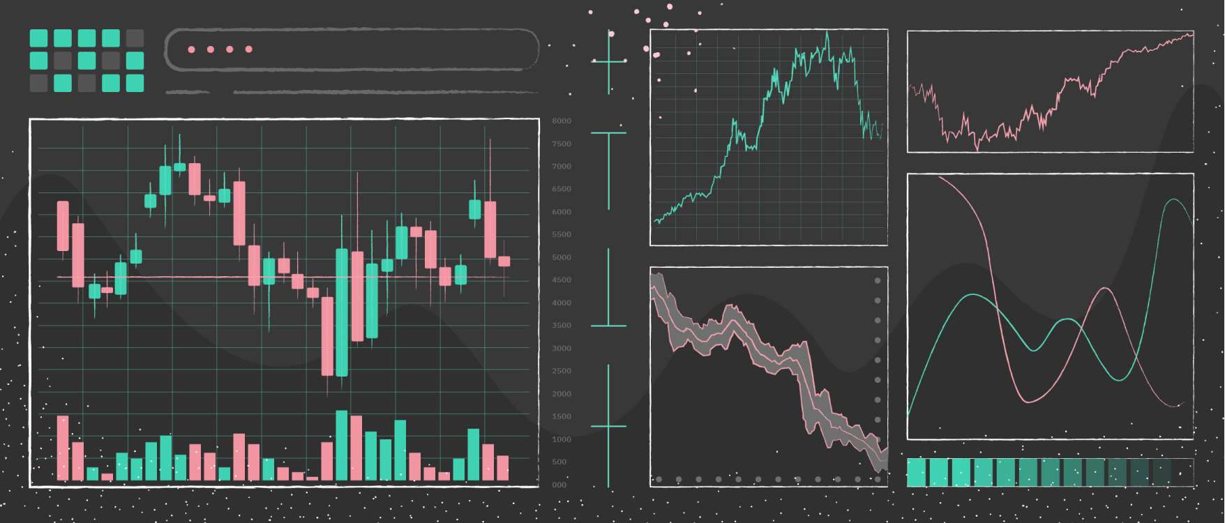
There are three major types of charts: lines, bars, and candlesticks.
Crypto traders prefer using various TradingView chart types. The platform offers a comprehensive range of trading charts for the majority of assets, including cryptocurrencies and futures.
Trading indicators are tools that provide a deeper insight into market movements and help users analyze and predict trends.

A proven leader, successful at establishing operational excellence and building high-performance teams with a sharp focus on value creation and customer success.